|
THE ATOMIC HYDROGEN EMISSION SPECTRUM This page introduces the atomic hydrogen emission spectrum, showing how it arises from electron movements between energy levels within the atom. It also looks at how the spectrum can be used to find the ionisation energy of hydrogen. What is an emission spectrum? Observing hydrogen's emission spectrum A hydrogen discharge tube is a slim tube containing hydrogen gas at low pressure with an electrode at each end. If you put a high voltage across this (say, 5000 volts), the tube lights up with a bright pink glow. If the light is passed through a prism or diffraction grating, it is split into its various colours. What you would see is a small part of the hydrogen emission spectrum. Most of the spectrum is invisible to the eye because it is either in the infra-red or the ultra-violet. The photograph shows part of a hydrogen discharge tube on the left, and the three most easily seen lines in the visible part of the spectrum on the right. (Ignore the "smearing" - particularly to the left of the red line. This is caused by flaws in the way the photograph was taken. See note below.)
| ||
|
Note: This photograph is by courtesy of Dr Rod Nave of the Department of Physics and Astronomy at Georgia State University, Atlanta. The photograph comes from notes about the hydrogen spectrum in his HyperPhysics pages on the University site. If you are interested in more than an introductory look at the subject, that is a good place to go. Ideally the photo would show three clean spectral lines - dark blue, cyan and red. The red smearing which appears to the left of the red line, and other similar smearing (much more difficult to see) to the left of the other two lines probably comes, according to Dr Nave, from stray reflections in the set-up, or possibly from flaws in the diffraction grating. I have chosen to use this photograph anyway because a) I think it is a stunning image, and b) it is the only one I have ever come across which includes a hydrogen discharge tube and its spectrum in the same image. | ||
|
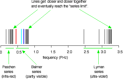
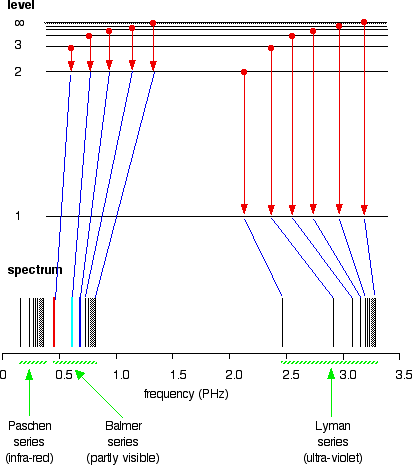
Extending hydrogen's emission spectrum into the UV and IR There is a lot more to the hydrogen spectrum than the three lines you can see with the naked eye. It is possible to detect patterns of lines in both the ultra-violet and infra-red regions of the spectrum as well. These fall into a number of "series" of lines named after the person who discovered them. The diagram below shows three of these series, but there are others in the infra-red to the left of the Paschen series shown in the diagram. The diagram is quite complicated, so we will look at it a bit at a time. Look first at the Lyman series on the right of the diagram - this is the most spread out one and easiest to see what is happening.
| ||
|
Note: The frequency scale is marked in PHz - that's petaHertz. You are familiar with prefixes like kilo (meaning a thousand or 103 times), and mega (meaning a million or 106 times). Peta means 1015 times. So a value like 3 PHz means 3 x 10¹⁵ Hz. If you are worried about "Hertz", it just means "cycles per second". | ||
|
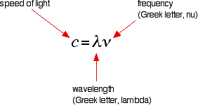
The Lyman series is a series of lines in the ultra-violet. Notice that the lines get closer and closer together as the frequency increases. Eventually, they get so close together that it becomes impossible to see them as anything other than a continuous spectrum. That's what the shaded bit on the right-hand end of the series suggests. Then at one particular point, known as the series limit, the series stops. If you now look at the Balmer series or the Paschen series, you will see that the pattern is just the same, but the series have become more compact. In the Balmer series, notice the position of the three visible lines from the photograph further up the page. Complicating everything - frequency and wavelength You will often find the hydrogen spectrum drawn using wavelengths of light rather than frequencies. Unfortunately, because of the mathematical relationship between the frequency of light and its wavelength, you get two completely different views of the spectrum if you plot it against frequency or against wavelength. The relationship between frequency and wavelength The mathematical relationship is:
Rearranging this gives equations for either wavelength or frequency.
What this means is that there is an inverse relationship between the two - a high frequency means a low wavelength and vice versa. | ||
|
Note: You will sometimes find frequency given the much more obvious symbol, f. | ||
|
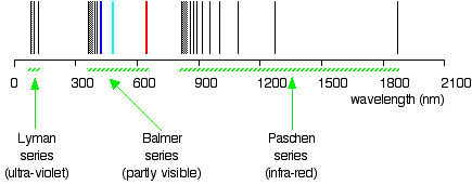
Drawing the hydrogen spectrum in terms of wavelength This is what the spectrum looks like if you plot it in terms of wavelength instead of frequency:
. . . and just to remind you what the spectrum in terms of frequency looks like:
Is this confusing? Well, I find it extremely confusing! So what do you do about it? For the rest of this page I shall only look at the spectrum plotted against frequency, because it is much easier to relate it to what is happening in the atom. Be aware that the spectrum looks different depending on how it is plotted, but, other than that, ignore the wavelength version unless it is obvious that your examiners want it. If you try to learn both versions, you are only going to get them muddled up! | ||
|
Note: Syllabuses probably won't be very helpful about this. You need to look at past papers and mark schemes. If you are working towards a UK-based exam and don't have these things, you can find out how to get hold of them by going to the syllabuses page. | ||
|
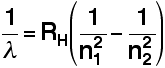
Explaining hydrogen's emission spectrum The Balmer and Rydberg Equations By an amazing bit of mathematical insight, in 1885 Balmer came up with a simple formula for predicting the wavelength of any of the lines in what we now know as the Balmer series. Three years later, Rydberg generalised this so that it was possible to work out the wavelengths of any of the lines in the hydrogen emission spectrum. What Rydberg came up with was:
RH is a constant known as the Rydberg constant. n1 and n2 are integers (whole numbers). n2 has to be greater than n1. In other words, if n1 is, say, 2 then n2 can be any whole number between 3 and infinity. The various combinations of numbers that you can slot into this formula let you calculate the wavelength of any of the lines in the hydrogen emission spectrum - and there is close agreement between the wavelengths that you get using this formula and those found by analysing a real spectrum. | ||
|
Note: If you come across a version of Balmer's original equation, it won't look like this. In Balmer's equation, n1 is always 2 - because that gives the wavelengths of the lines in the visible part of the spectrum which is what he was interested in. His original equation was also organised differently. The modern version shows more clearly what is going on. | ||
|
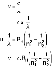
You can also use a modified version of the Rydberg equation to calculate the frequency of each of the lines. You can work out this version from the previous equation and the formula relating wavelength and frequency further up the page.
| ||
|
Note: You may come across versions of the Rydberg equation where the n1 and n2 are the other way around, or they may even be swapped for letters like m and n. Whichever version you use, the bigger number must always be the one at the bottom of the right-hand term - the one you take away. If you get them the wrong way around, it is immediately obvious if you start to do a calculation, because you will end up with a negative answer! | ||
|
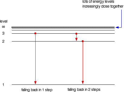
The origin of the hydrogen emission spectrum The lines in the hydrogen emission spectrum form regular patterns and can be represented by a (relatively) simple equation. Each line can be calculated from a combination of simple whole numbers. Why does hydrogen emit light when it is excited by being exposed to a high voltage and what is the significance of those whole numbers? When nothing is exciting it, hydrogen's electron is in the first energy level - the level closest to the nucleus. But if you supply energy to the atom, the electron gets excited into a higher energy level - or even removed from the atom altogether. The high voltage in a discharge tube provides that energy. Hydrogen molecules are first broken up into hydrogen atoms (hence the atomic hydrogen emission spectrum) and electrons are then promoted into higher energy levels. Suppose a particular electron was excited into the third energy level. This would tend to lose energy again by falling back down to a lower level. It could do this in two different ways. It could fall all the way back down to the first level again, or it could fall back to the second level - and then, in a second jump, down to the first level.
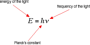
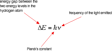
Tying particular electron jumps to individual lines in the spectrum If an electron falls from the 3-level to the 2-level, it has to lose an amount of energy exactly the same as the energy gap between those two levels. That energy which the electron loses comes out as light (where "light" includes UV and IR as well as visible). Each frequency of light is associated with a particular energy by the equation:
The higher the frequency, the higher the energy of the light. If an electron falls from the 3-level to the 2-level, red light is seen. This is the origin of the red line in the hydrogen spectrum. By measuring the frequency of the red light, you can work out its energy. That energy must be exactly the same as the energy gap between the 3-level and the 2-level in the hydrogen atom. The last equation can therefore be re-written as a measure of the energy gap between two electron levels.
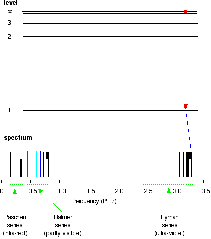
The greatest possible fall in energy will therefore produce the highest frequency line in the spectrum. The greatest fall will be from the infinity level to the 1-level. (The significance of the infinity level will be made clear later.) The next few diagrams are in two parts - with the energy levels at the top and the spectrum at the bottom.
If an electron fell from the 6-level, the fall is a little bit less, and so the frequency will be a little bit lower. (Because of the scale of the diagram, it is impossible to draw in all the jumps involving all the levels between 7 and infinity!)
. . . and as you work your way through the other possible jumps to the 1-level, you have accounted for the whole of the Lyman series. The spacings between the lines in the spectrum reflect the way the spacings between the energy levels change.
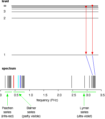
If you do the same thing for jumps down to the 2-level, you end up with the lines in the Balmer series. These energy gaps are all much smaller than in the Lyman series, and so the frequencies produced are also much lower.
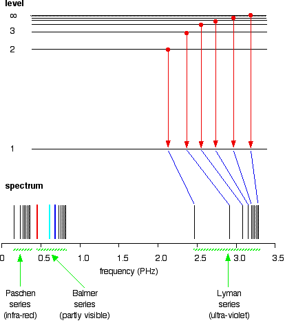
The Paschen series would be produced by jumps down to the 3-level, but the diagram is going to get very messy if I include those as well - not to mention all the other series with jumps down to the 4-level, the 5-level and so on. The significance of the numbers in the Rydberg equation n1 and n2 in the Rydberg equation are simply the energy levels at either end of the jump producing a particular line in the spectrum. For example, in the Lyman series, n1 is always 1. Electrons are falling to the 1-level to produce lines in the Lyman series. For the Balmer series, n1 is always 2, because electrons are falling to the 2-level. n2 is the level being jumped from. We have already mentioned that the red line is produced by electrons falling from the 3-level to the 2-level. In this case, then, n2 is equal to 3. The significance of the infinity level The infinity level represents the highest possible energy an electron can have as a part of a hydrogen atom. So what happens if the electron exceeds that energy by even the tiniest bit? The electron is no longer a part of the atom. The infinity level represents the point at which ionisation of the atom occurs to form a positively charged ion. Using the spectrum to find hydrogen's ionisation energy When there is no additional energy supplied to it, hydrogen's electron is found at the 1-level. This is known as its ground state. If you supply enough energy to move the electron up to the infinity level, you have ionised the hydrogen. The ionisation energy per electron is therefore a measure of the distance between the 1-level and the infinity level. If you look back at the last few diagrams, you will find that that particular energy jump produces the series limit of the Lyman series. | ||
|
Note: Up to now we have been talking about the energy released when an electron falls from a higher to a lower level. Obviously if a certain amount of energy is released when an electron falls from the infinity level to the 1-level, that same amount will be needed to push the electron from the 1-level up to the infinity level. | ||
|
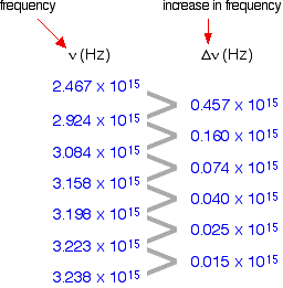
If you can determine the frequency of the Lyman series limit, you can use it to calculate the energy needed to move the electron in one atom from the 1-level to the point of ionisation. From that, you can calculate the ionisation energy per mole of atoms. The problem is that the frequency of a series limit is quite difficult to find accurately from a spectrum because the lines are so close together in that region that the spectrum looks continuous. Finding the frequency of the series limit graphically Here is a list of the frequencies of the seven most widely spaced lines in the Lyman series, together with the increase in frequency as you go from one to the next.
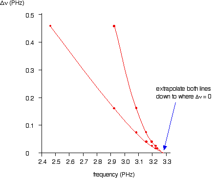
As the lines get closer together, obviously the increase in frequency gets less. At the series limit, the gap between the lines would be literally zero. That means that if you were to plot the increases in frequency against the actual frequency, you could extrapolate (continue) the curve to the point at which the increase becomes zero. That would be the frequency of the series limit. In fact you can actually plot two graphs from the data in the table above. The frequency difference is related to two frequencies. For example, the figure of 0.457 is found by taking 2.467 away from 2.924. So which of these two values should you plot the 0.457 against? It doesn't matter, as long as you are always consistent - in other words, as long as you always plot the difference against either the higher or the lower figure. At the point you are interested in (where the difference becomes zero), the two frequency numbers are the same. As you will see from the graph below, by plotting both of the possible curves on the same graph, it makes it easier to decide exactly how to extrapolate the curves. Because these are curves, they are much more difficult to extrapolate than if they were straight lines.
Both lines point to a series limit at about 3.28 x 10¹⁵ Hz. | ||
|
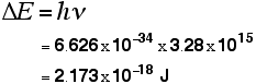
Note: Remember that 3.28 PHz is the same as 3.28 x 10¹⁵ Hz. You can use the Rydberg equation to calculate the series limit of the Lyman series as a check on this figure: n1 = 1 for the Lyman series, and n2 = infinity for the series limit. 1/(infinity)2 = zero. That gives a value for the frequency of 3.29 x 10¹⁵ Hz - in other words the two values agree to within 0.3%. | ||
|
So . . . now we can calculate the energy needed to remove a single electron from a hydrogen atom. Remember the equation from higher up the page:
We can work out the energy gap between the ground state and the point at which the electron leaves the atom by substituting the value we've got for frequency and looking up the value of Planck's constant from a data book.
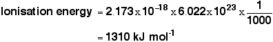
That gives you the ionisation energy for a single atom. To find the normally quoted ionisation energy, we need to multiply this by the number of atoms in a mole of hydrogen atoms (the Avogadro constant) and then divide by 1000 to convert it into kilojoules.
| ||
|
Note: It would be wrong to quote this to more than 3 significant figures. The value for the frequency obtained from the graph is only to that accuracy. | ||
|
This compares well with the normally quoted value for hydrogen's ionisation energy of 1312 kJ mol-1.
© Jim Clark 2006 (last modified August 2012) |
||